Deutsch Französischer Bürgerfonds
Better user experience through better user guidance.
The revised website of the Deutsch-Französischen Bürgerfonds presents itself with a clear, optimized user interface and simplified management options for the team.
Visit: buergerfonds.eu
A year into the launch, the Franco-German Citizens’ Fund identified serval issues on their community fund website, which hindered both community members and staff members from effectively succeeding in their communicative intent. Our task was to remove these issues.
High-level goal: An attractive, accessible offer
The Deutsch-Französische Bürgerfonds (Franco-German Citizens’ Fund) advises and finances projects that enable the general public to experience Franco-German friendship and Europe. It promotes a variety of formats and topics, is easily accessible, and is open to all civil society actors.
Furthermore, it connects project initiators and facilitates a strong network of citizens dedicated to Franco-German friendship. The site also functions as a promotional platform that addresses various multipliers interested in learning more about the community and the work and efficiency of the Citizens Fund.
The overarching goal of the website is to make project advice, application and financing processes as smooth as possible for project initiators while allowing the Franco-German Citizens’ Fund to be perceived as an attractive enabler in the Franco-German engagement.
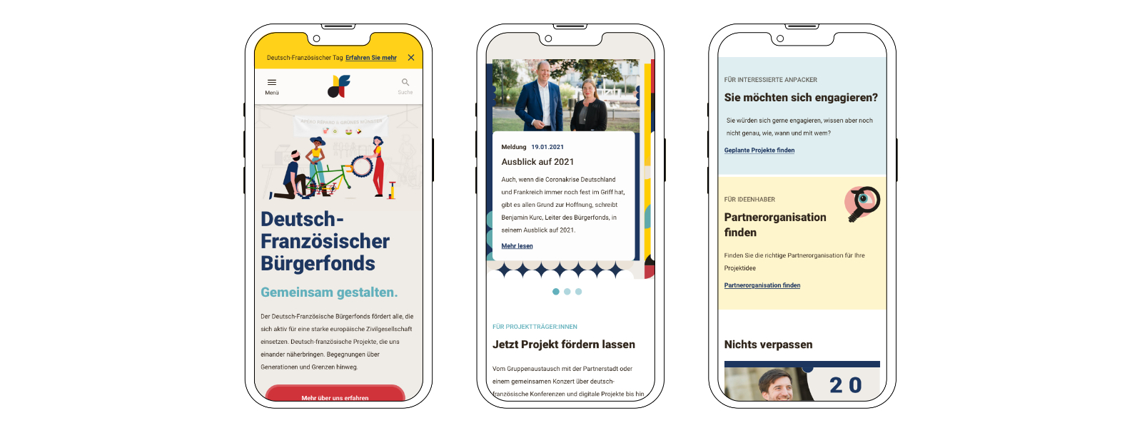
The new homepage design with teasers that kick off the prioritized user journeys.
Existing Pain Points
- The website was failing to help people to help themselves. Page Visitors had difficulty finding the information and documents required to initiate projects, even though the documents and pages were available via the page menu. Assuming that visitors did not understand the language in use, likely because it resembled the point of view of the Franco-German Citizens’ Fund. The result was an overwhelming 1:1 consultation workload.
- Project descriptions in the matching platform lacked information quality. The project matching platform is the core of the service, where interested project sponsors find suitable project partners. Project descriptions are user generated. Many entries had poor quality or missing information, which reduced matches and weakened the facilitating role and image of the citizen fund.
- Site editors were unsatisfied with their options to create visual hierarchies. Site editors felt restricted by the available elements and templates. They requested better solutions, enabling interesting and more helpful pages and information structuring.
Project Goals
- Improve user guidance and decrease 1:1 support cases. Focus points were improving processes for user-generated content and increasing accessibility and findability of content supporting this process.
- Minimize aborts and information gaps during project creation.To increase the number of project inquiries and ultimately funded projects, the project creation process needed to result in easy-to-understand and complete project descriptions.
- Visual orientation and design.Visitors needed to be able to identify relevant content. Core and premium information (community projects and interviews) had to receive the visual elevation they deserved.
- Image promotion.All goals played into the overlying strategy, which was to strengthen the image of the citizens’ fund as an innovative, attractive and successful player and facilitator in German-French engagement.
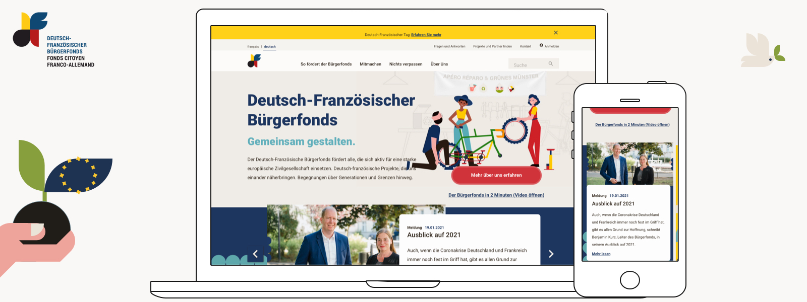
The new homepage design in the desktop and mobile viewports.
Our UX solutions
The high-level strategy the website needed to achieve was to streamline the project consultation, application and financing process with as few barriers as possible for project initiators. We provided the following solutions:
#1 Improve user guidance by speaking the same language and complying with the mental models of project initiators.
While the existing navigation contained all menu items and information that project initiators required – the menu was not working. The community fund still received calls and emails asking for links to pages and documents that were part of the menu. Instead of the site being a self-serving tool, it became a starting point for 1:1 consultations.
Project initiators did not speak the language used in the menu. This discrepancy was especially true for the primary menu level. As a result, menu items failed to invite initiators to inspect them further and discover more concrete menu points of the second level. Instead, the site visitors chose the most promising solution to solve their goals: direct contact.
We suggested new copy text and grouped menu items so they spoke to site visitors intending to find information on project funding and initiation.
We redesigned the functionality of the menu to allow visitors to display and compare lower levels more effectively and included a section that allowed the team to curate menu items and add important links (quick links) and documents (downloads).
Usability Heurisik Nr. 2
Match between system and the real world
The design should speak the users’ language. Use words, phrases, and concepts familiar to the user, rather than internal jargon. Follow real-world conventions, making information appear in a natural and logical order.
Nielsen, J. (1995, 2020)
#2 Reduce abort rates during project creation through form and process improvements
Improving copy to meet the needs and thinking patterns of the users was helpful for the project creation process. Initiators can publish planned projects on buergerfonds.eu to promote them and win over partners interested in collaboration. Unambiguous microcopy (for process steps, labels, sublines, etc.) simplifies the process.
During the interaction design phase, we redesigned project creation into a comprehensive multi-step process by splitting the form into small, easily consumable units, reducing complexity.
Additionally, we questioned the necessity of all form fields and ensured transparency for users by providing suggestions for info texts. Supporting text can explain why information is required and its intended use.
In sum, these seemingly minor tweaks can ensure process completion and reduce aborts when creating projects. Furthermore, users feel supported during the process, significantly improving the quality and completeness of this user-generated content.
As a result, this has a positive effect on increasing project inquiries and ultimately funded projects, which contributes to the community fund’s goal of strengthening its image as a successful facilitator, while reducing support inquiries via telephone or e-mail.
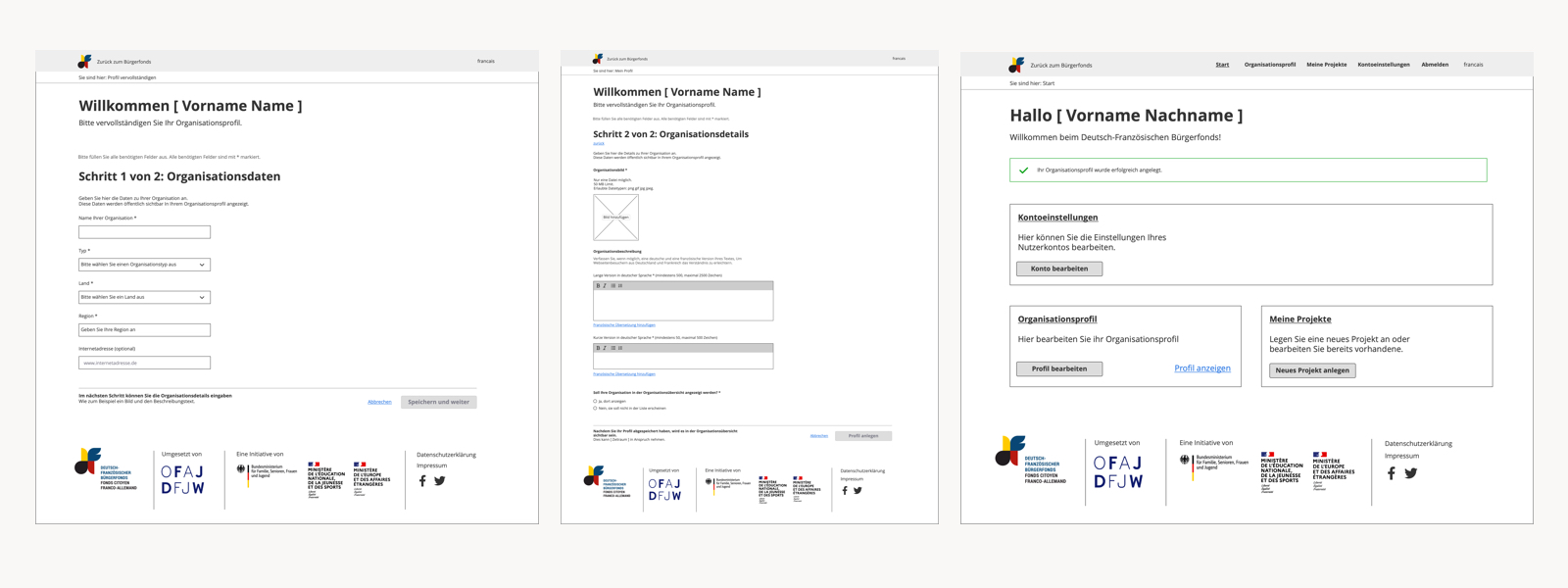
Wireframes showing the onboarding for organisations. People scan forms to estimate how much time their completion will take. Complexity increases the likelihood of process abortion. Dividing complex forms into several meaningful, comprehensible steps can be beneficial.
#3 Improve orientation through a visual design that takes human perception into account
Visual design is more than just beautifying – it is functional! It serves the visual identity, offers orientation and scalability and ensures the visibility of relevant information.
An existing visual identity, including a logo, brand colours, typography, illustrations, and picture ratios, was the base for the UI Design for the new components. While we had many visual options, the identity required a structure that allowed visually cohesive scalability.
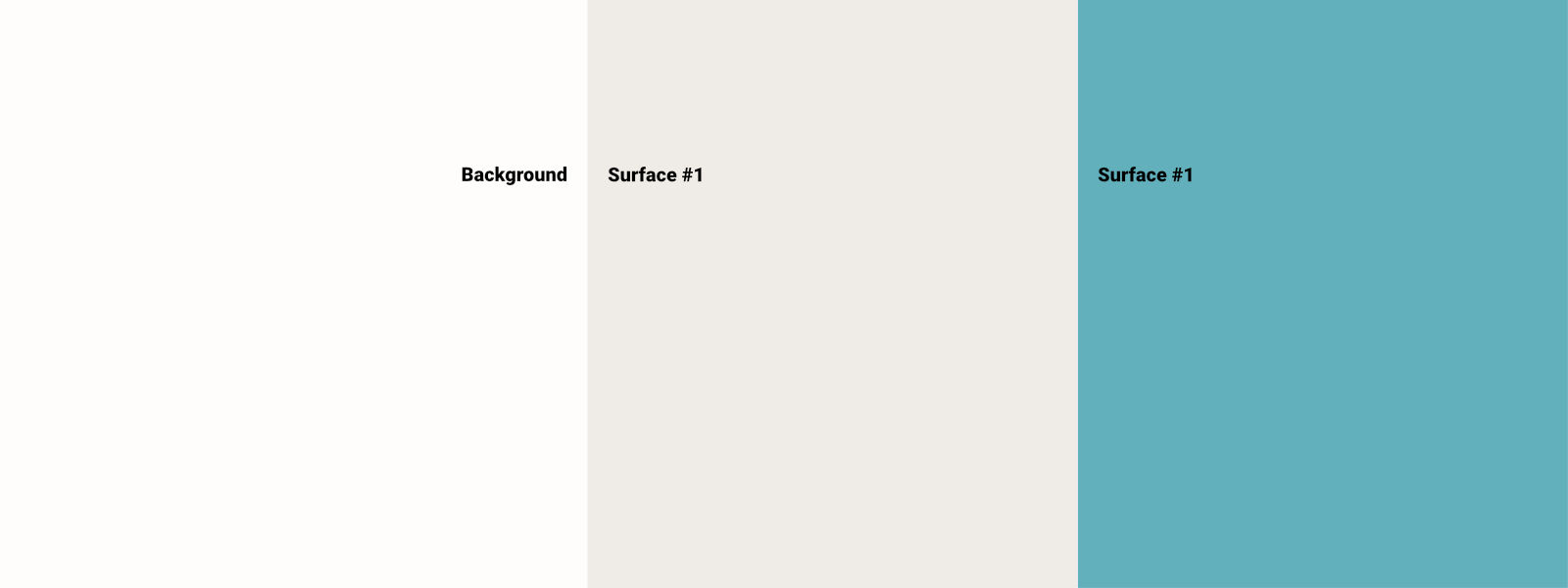
Lighter brand colours we used for backgrounds and surfaces.
Deliberate colour use has a high impact on visual hierarchies and thus on attention control and is therefore essential for user guidance. We focused on using shades of the existing colour library and colours repeatedly used in the illustrations to create a visual hierarchy and structure. Backgrounds and surfaces used lighter colours, while bright and bold colours created pop-out effects and provided clear visual feedback for interactivity. Both visual hierarchy and feedback are essential when guiding visitors.
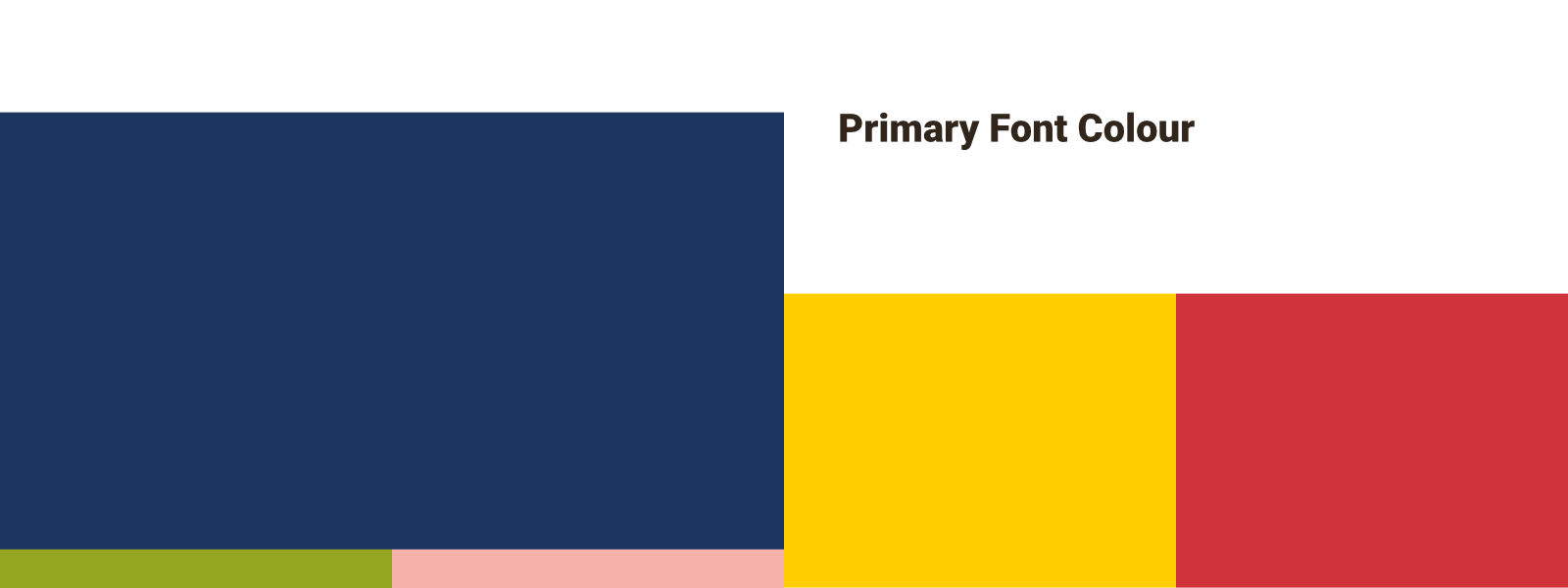
Brighter brand colours we used for primary and secondary UI elements, feedback and status colours.
#4 Establish a sustainable design through a Design System
We set up the visual design in a small Design System to provide an overview of all existing elements. A Design System gives context for tokens and components while making the interrelation comprehensible.
Overview and understanding are essential for teams when new requirements arise. They can aid decisions if existing elements can solve new requirements or if new designs and developments are necessary. Existing elements inform new developments, making a Design System a sustainable and cost-saving investment.
As we were working with a small team and an existing data set, our visual design additionally ensured that available images and content types could stay in place and remain untouched and would be easily reusable in the new design.
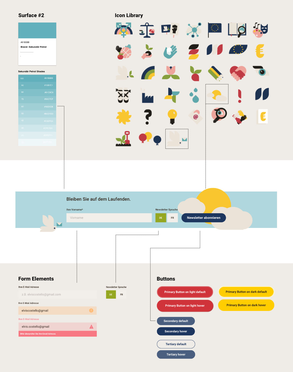
The Design System supports future developments of the French-German Citizens’ Fund. Components are composed of various design tokens with the LEGO principle.
The new components provided advanced storytelling and highlighting options enabling the team to display important information more pleasingly and clearly, increasing the findability of relevant information. Well-informed audiences that have retrieved the information they seek in an easy and pleasurable manner are more likely to follow through with their initial goals.
The Franco-German Citizens’ Fund benefits from the design with a decrease in requested 1:1 consultations and an increase of attractive projects in their project matching platform, strengthing their role in the Franco-German engagement.
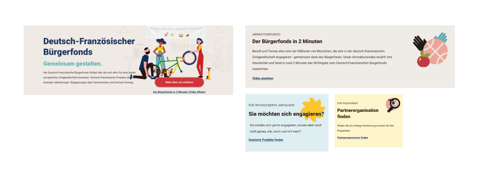
Various teaser options and sizes to visually highlight site content and documents supporting the primary initiator journeys.
Most challenging
Many roads lead to Rome! So true, especially for User Experience Design solutions. Creating solutions that work just as well for the audience as they do for the various client stakeholders is always part of the challenge. This project presented an additional challenge: finding the economic sweet spot for a young facilitator with limited resources. We wanted feasible solutions for a small team while having the highest impact possible. Consequentially the content structure stayed in place, and other aspects like image sizing were untouched. Our design was therefore based on existing technology, visual identity and content formats.
Most fun
Collective, border-conquering experiences can increase understanding and empathy and even be the start of true friendships. As European citizens, we were thrilled that we were allowed to participate in this project and hopefully help facilitate a lively Franco-German society.
Interested in working with us?
We can support you in developing ideas and concepts and advise you on tricky UX challenges or frustrated users. Contact us and tell us more about your plans in a free introductory meeting.
