Inhaltsverzeichnis:
A case study of our first pitch experience
In the midst of last summer’s dog days we were following our morning routines containing smalltalk, twitter coffee, dealing with waking up, more coffee, slowly getting into workmode, opening mail, when – bam! – _the_ email appeared in our inbox. Now, we were fully awake.
Roughly it said something like this:
‘Hello Geekettez, after our long-standing museum’s restoration we are currently planning the reopening of our exhibition. For this we require support in creating a new visitor concept and need help developing an extended experience through mobile devices like smartphones and tablets’.
Sincerely , Museum of Boppard
Deep breather. What were we to do?
We do not know how your opinion is when it comes to design pitches and therefore often – let’s face it: spec work. Pitching can be a little bit awkward and is often associated with “prospective clients”, who seem to be looking for the best and cheapest solutions by getting a ton of amazing and free ideas from several agencies and studios, which they then can cherry-pick from. Client heaven.
We are a small studio that does not have the financial backbone and capacity to work on pitch ideas for several weeks, for free, putting all other stuff aside, hoping to get the job. We don’t have an entire design team working in the background on spec projects while we could go on with our daily business which pays our rents. This was one of the reasons why we had turned every design pitch down in the past, another reason, however, was that they had simply never been interesting enough.
But this one got our attention. As mentioned, simply because we thought this might be a really cool project! A museum asking for help with “(…) extending the exhibition experience through mobile devices.”
Dopamine biased ideas ran through our brains and we felt like hyper drugs were released in our blood vessels. Our eyes began to shine: the Internet of Things! Ubiquitous Information! Hyper fancy exhibition design! Hell yes!
YES, OF COURSE WE LIKE TO DO THIS!
A few minutes later however we realized: We can’t do this by ourselves. We had to find a partner for the tech side of the project and ‘big’ business-related things. And to top this off, we had to find a partner we could rely on. In other words: Reality came back. Hit us hard and we took a closer look at the challenges we were facing:
First, took another look at the briefing. The information was rough at best (probably a common pitch problem). We had no information on who we were designing for, what problem needed solving, what the budget was and we had never met the client and did not know how they were lined up and what their expectations were. These questions could have been answered in a kick-off meeting. But instead of that we received the notice that the client had left for vacation and was to be expected back in two weeks.
Secondly, after the client’s return, the finished concept and pitch proposal was expected to be ready on their desk. This meant we had two weeks to get all the information we needed (as it looked on our own), read and understand the attached exhibit concept, do research, come up with a design and tech concept and a bulletproof proposal.
And as if this wasn’t enough headache, we also had to deal with a third challenge: finding a tech savvy, reliable partner – at best with some expertise in the area of culture project. We solved challenge #3 fast: We decided to team up with xailabs, an amazing Berlin company who are not only reliable and have the best tech dudes in town but who also have much experience when it comes to cultural projects.
One challenge down. Two to go. Time was running. Tick Tock!
Allright universe! Challenge accepted!
Eliminating challenge #1
The museum had sent us the new exhibition concept, which had been created by the local culture office they collaborate with. The concept had contained a few recommendations concerning digital media. However we had no clue of these recommendations had been nodded off by the museum or if they were simply rough ideas. So we decided to make a list of things that we thought were facts or decisions set in stone to then be able to add uncertainties to the question list, which we hoped we could talk through with someone, at some point, soon, very soon. The lists were based on our briefing and a first round of basic research.
Facts & things set in stone:
We were lucky the briefing had contained a bold intention:
The museum was planning a participative approach, which meant: tearing down the borders between the museum and the people/visitors/citizens. The museum no longer wanted to hold the role of the “expert” while their visitors should no longer hold the “student” roles.
Further we knew:
– that the museum is a historical museum with its town history as main topic
– the visitor number per year
– that those visitors were mostly tourists
– the newly planned distribution of the exhibition spaces
Based on this information we made assumptions on the museum’s goals for the new concept:
– We assumed that the new roles of museum and visitors also meant that they would like to strengthen the relationship to the town’s citizens by including them more. This would also lead to more visitors within the town.
– This intention, as well as the plan to use of mobile devices, also lead us to believe that they would like to boost the ‘brand’ ‘Boppard’.
– In general, the renovations and the new tour seemed like a budget heavy venture, which is why we set “increased visitor numbers” as an additional goal.
To make sure we had understood everything correctly and weren’t missing anything we visualized the text-heavy brief and goals for internal purposes. Our goal was to create a visualization that could inspire ideas but held all the required information we had to consider.
Armed with all this information we sat down with our brand new teammates from xailabs to go through all of it and create a list of questions that we all felt needed answers. Therefore, we decided to call the museum and talk to them. The list contained questions from many areas. We had to find out more about the potential users, their tech affinity and their expected personal device accoutrement (a.k.a. will the visitors be using their own mobile devices or will the museum provide the devices?). We also had to discuss dreams in this area and find out who the “dream visitors” were so we could keep the concept scalable in the right direction.
Getting back to the tech side of things, we had no idea if the museum had in-house technicians, a wifi in place and if not if they required support when setting this up and maintaining it. The running setup was also a big question. Was there an existing content management system we had to build upon? Clients also often ask for native apps even though a responsive website will do just fine, especially if you are keeping an eye on the budget (which we assumed they were).
In the design area, we had a whole new batch of questions. We did not know if they were expecting a new corporate design to be part of the proposal or how far we should/could go when planning the user experience and interaction design (Do elderly tourists dig augmented reality?).
Basic project information like deadlines or budget were also unknown to us.
So, we finally did this phone call, and got more or less some information on most question.
Remaining still a lot of questions – but one big win! We figured out that we can collaborate with the cultural office, that they are open to suggestions based on the concept which will come from the ‘digital side of life’ and they will extend their concept if needed so.
Eliminating challenge #2
What we finally came up with – our solutions
As we got closer to the deadline we put our heads together to nail down the concept. We had to hurry because the tech proposal that we were including was obviously based on our concept. To stay within our budget guess we had already decided on offering a responsive website instead of native apps and on not including corporate design work as we did not know if this was required and it could have easily blown the proposal up to an intimidating size.
We split the proposal into two parts:
Part 1 – A basic but extendible version that could meet an eventually tight budget
Part 2 – An idea list of optional modular extensions/ elements/ components that could top off the basic version at any given time.
In addition we suggested the design of a signage system that could be used within the museum as well as outside of the museum in the city. The signs were to be placed at interesting sights and showed a catalog number, which the user could enter into the mask of their mobile device and retrieve interesting facts on the object of interest. The conceptual development of the signs was part of our proposal. The visual design and production however fell into the corporate design package, which we chose not to make part of the offer. So you see how complicated this got.
The concept of these signs was important for us because the briefing had suggested the use of QR codes. However as we had decided on a responsive website we could not integrate a QR code scanner, which would have meant that the user would have had to switch back and forth from a QR code scanner app (which he may or may not have on his mobile device) and the website. In addition we had identified the potential users as elderly tourists, who in average were not too tech savvy. To this target group QR codes might look like spaceship landing pods. This was the assumption we made as we did not have more time for target group research.
And this is how we imagined our tour to work:
PART 1 – the basic / extendible experience
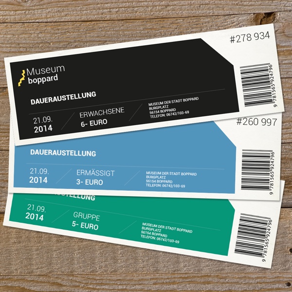
When entering the museum, each visitor to the museum will receive a ticket. A random number printed onto this ticket will enable the visitor to anonymously log in so they can track their visit. The visitors log in via the responsive website that they can visit via their personal mobile device. The tracking system shows which exhibits they have retrieved additional information on (by entering the number) and offers further links, facts, books etc. on the subject, which they can bookmark and revisit at a later point. This is interesting for both the visitor and the museum. People will receive a digital souvenir, one that neither requires paper nor a pencil to note what the visitor is interested in. The museum will have traffic on its web site and insights on what’s top and what’s flop. In addition, this functionally can strengthen the museums’ brand.
The centre of our concept was the so-called ‘collection’. The collection connects exhibits inside the museum or places of interest within the city with further content, which is relevant and/or related. The connection is made via the exhibit numbering system, which we described earlier. Content within the collection could be of any format: audio, text, video etc.. Furthermore, the information could also be prepared for special groups such as children or elderly people.
The collection can be retrieved anywhere – during the visit to the museum or afterwards at home sitting in front of the computer or while exploring the city.

- Image 1: A father visiting the museum with his kid. They view the same exhibit but retrieve different information.
- Image 2: The father is now in the city visiting a related object of interest. The kid is probably off getting ice cream.
- Image 3: Thanks to the tracking system the kid can show Mom what he saw during his visit. All he has to do is re-enter his number on entry ticket he received.
In addition to the enhanced information database, the collection offered another benefit. If the visitor chose to use the “user-centred guided tour” he would receive a floor plan, which guided him within the museum to find related objects or a google maps application, which would show the related objects within the city. This would get the visitors to move differently within the museum, allowing them to see what interests them the most, even with limited time. In addition, the museum and the sights within the city could be brought into direct context, moving together more closely and turning the visitor’s stay within the city into an extended museum visit, bringing the single exhibits to life.
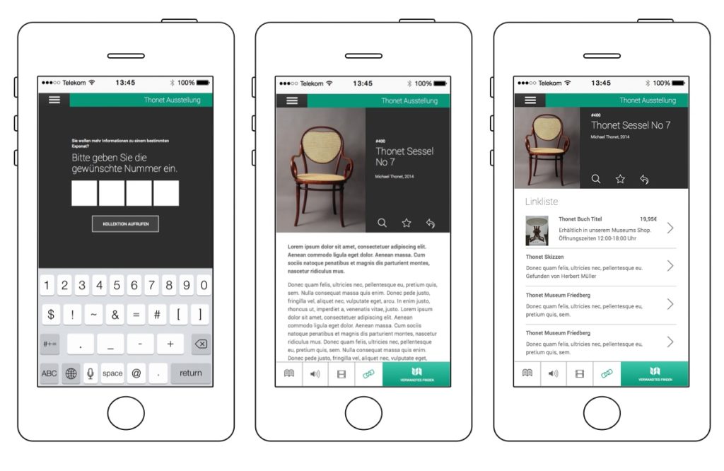
To top this experience off we suggested an additional participative layer. The signage system would not only allow tourists to experience the history of the city but could also include the city’s residents and their knowledge. In a lean process, everyone was to be invited to add their knowledge on exhibits in a user-generated wiki. This would allow the exhibition and the city to profit from its citizens and keep growing. Long time residents, who may have even lived in the city their whole life are likely to have additional resources, photos or documents, which they may want to add to the collection. Such actions will lead to increased “identification” and (citizen) engagement with the museum and tear down those ‘expert/visitor’ walls the museum had talked about in their briefing.
To support and visualize the written concept paper we did a lot of wireframed based mockups, visualized use cases and created drafts of visual design comps.
PART 2 – the modular extensions
We developed many further ideas and explained them within the concept paper. This included some basics that the museum website did not have yet, things like an event calendar, an online store and social media activities (which were already set up but not in proper use).
And as this was a fun project for us, we continued by suggesting some fanciness such as interactive displays instead of analogue exhibit panels, an interactive timeline of the town’s history which could be connected to the exhibits within the collection and – (tadaaa!) Internet of Things related techniques. Among other things, we thought of exhibits which could send tweets to the outside world and communicate with related exhibits in museums all over the globe to create a ‘living’ network of exhibits. This could increase the range of the museum dramatically and promote a worldwide museum network increasing visitor engagement, visitor numbers and tourism in general.
One of our last suggestions was to meet up in person to clarify open issues. And after that, we were done and mighty proud of our work. We were pleased with what we had achieved and happily sent out our conjoint proposal with xailabs.
Few weeks later, they told us we had not won the pitch.
What we took away from that experience?
A HELLUVALOTTA LEARNINGS , that’s what
1. WE LOVE OUR JOB
While pitching we had sat down like in an idea bootcamp. It was fun, really! We came up with so many ideas we would have loved to suggest to the museum and this let us realize: we really, really love what we do.
When someone throws us a bone in the shape of a vague briefing, we accelerate. Why? Because we are inspired! We saw so many possibilities and awesome off the hook opportunities. The challenge was finding the perfect proposal between “unrealistic” approaches concerning time and budget and a concept that did not overwhelm the museum but made them feel as inspired as we felt. The results of this challenge were mostly based on gut feeling as we were doing this for the first time. xailabs was a great partner, who’s experienced in this area also helped us make these tough decisions.
2. WE LIKE TO HAVE FUN
Not winning the pitch was – surprisingly – no big drama for us. We had so much fun when creating this concept, spinning ideas back and forth and of course we lost money. A lot.
We do not know what the reason of the pitch failure was. We asked for feedback but we did not get a reply on the reason why we weren’t chosen. Maybe we did not include everything they wanted to see in the proposal (like the corporate design) or they thought it too over the top or maybe they simply didn’t like the whole concept. Maybe Shmaybe. We don’t know but in the end, it wasn’t really that important to us. Because we spent two weeks on a super fun project.
3. WE TAKE RISKS
Pitching is spec work and therefore a risk. We all know it. We all dislike it. Many agencies do it anyway. Small studios like us and freelancers mostly can’t afford it.
Nevertheless, we did it. But why? Pitching is about taking a risk. Pitching is about learning to take risks. Pitching is like playing a game of poker and using your ideas as stakes. Should you be progressive and prepared to take risks or stick to “grounded” and established concepts and play it safe? Ask yourself: What do you want or expect from your job/work? Do you want freedom or do you want security? And then play it as you call it.
For us it was about intrinsic motivation. No more, no less. But if you’d ask us if we’d pitch again, we would say, “HELLYEAH, if the bone looks tasty!”
So, we’re interested in your opinion:
– We were lucky to have an experienced partner on board, who taught us much in the process. What do you wish you had known before your first pitch?
– Small studios and freelancers: do you pitch? For what reasons?
Related
https://www.buzzfeed.com/scholzfriends/21-dinge-die-zu-jedem-pitch-geharen-12958
Image credits
Top Image photo credit: n474_w1150 via photopin (license)
Animated gif Image Source:https://31.media.tumblr.com/tumblr_m97kt6lbWD1qcysh1o1_500.gif
