Or: A different approach in creating visual designs for web and mobile applications.
Nowadays, as websites are turning more and more towards behaviour-driven applications, a polished, overall screen design of every page makes – in our opinion – no sense at all.
We can spend time more effectively and increase work on the concept and behaviour of the product instead of spending weeks pushing pixels. The concept and behaviour include interaction design, flow and user experience with rough scribbles and sketches or high-fidelity wireframes.
This does not mean that we believe visual design is not necessary or significant instead, we believe visual design is part of the UX. Our goal, however, is to keep it agile and slim.
We are both fans of modular design and discovered we have the same approach when creating visual designs. Our similar processes led us to come up with something we call GUI libraries.
Inhaltsverzeichnis:
GUI libraries and their benefits
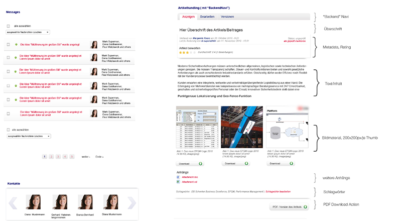
A GUI library can replace a full-blown page-to-page screen design but will require an overview of the site in the shape of wireframes or scribbles.
The advantages of GUI libraries:
- The designer must think closely about and decide what elements are in use.
- A GUI library provides a good overview of all existing elements.
- This overview will increase consistency and a coherent visual language throughout the entire design process, even if you (or someone else) continue to work on it years later.
- A GUI library is expandable and modular and thus perfect for agile projects.
- The library functions as documentation, making the lives of developers and fellow designers easier.
- Stressful and nerve-racking Photoshop layer terror will be a thing of the past, as will font-searching, colour-picking and other tedious tasks.
- Last but not least – it is a much faster process than designing all the main pages or even every single damn page in Photoshop!
If we reach a point in the project where there is uncertainty about the look of a specific page or the behaviour of an element we can sketch it out with scribbles or wireframes and have an answer more quickly than when working with high-fidelity visual designs of entire pages.
The importance of Master Layouts for GUI libraries
We work with GUI Libraries as an addition to one or two visual Master Layouts – finetuned screen designs of pages defined by the client. The Master Layouts define the general and global site layout as the grid, typography, colour scheme and universal elements such as header and footer, as well as page types.
When creating the page types in a Master Layout we also answer key questions like the following:
- What will the column layout of our page types look like?
- What are the sizes of the columns in the different layout types?
We provide answers by defining a grid and creating a visual composition with a visible grid that can demonstrate the usage of the grid and the different column widths. The information will prevent developers and fellow designers from having to dive deeply into a Photoshop file having to search for layer #666. Instead, they will receive the information at one glance at the document. It’s easy to use!
We present Master Layouts to the client. It informs them about the look and feel of the site and can also answer important questions concerning the entire product. It is a good foundation the client can use to provide feedback.
Once the Master Layout is approved we begin work on our GUI Library. The library may be one or two Photoshop files, containing ALL of the elements used within the product.
A GUI library could include:
- colour specs with hexadecimal definitions
- a typographic sample with all text variations such as headlines, paragraph text and links
- list elements, list header, even and odd list rows..etc
- tables
- all icons
- buttons (in all states)
- the primary call to action and secondary actions
- image sizes, image ratios and formats
- default images, e.g. avatars
- all form elements
- system feedback, e.g. error messages, warnings and notifications
- etc
The bonus: as your GUI library begins to fill up, your design documentation will become visible. At the end of the process, it will be complete and ready to scale when you add new elements.
Our workflow in detail – a summary
Summed up our workflow looks like the following:
- Wireframes and the flow of the site (in the best case)
- Master Layout with universal design definitions such as colour, typography, grid and global product elements (e.g. header and footer). We design one or two full visual screen designs depending on the site.
- Client feedback and approval
- GUI Library set-up and design
- Optional graphics and image exports for the development team
This workflow works quite well for us as well as our clients. What does your workflow look like? We are curious to learn from fellow designers and developers!


