Inhaltsverzeichnis:
- 6 UX flaws to avoid if you want to design stories with happy endings
- Flaw #1: Speaking in company lingo.
- Flaw #2: Using ambiguous wording.
- Flaw #3: Setting your customers up to fail.
- Flaw #4: Missing out on defining standards.
- Flaw #5 Slacking on information architecture.
- Flaw #6 Pissing off your customers.
6 UX flaws to avoid if you want to design stories with happy endings
Last week I was standing in line to get a post stamp at the German post office. A task that can be done at the counter but also at annoying machines that give out 1 cent stamps (instead of change) if you put in too much money. You might have guessed it: these machines are not liked but are still used, especially if the the line at the counter is too long, which is exactly the reason why I was standing in line at one of these machines on this sunny day. A couple in front of me was desperately trying to get some stamps out of this machine. The couple were in their late 50s‘ and most likely have had their share of human-machine interaction, probably even use smart phones on a regular basis. But this machine was showing them who was boss. After briefly watching their struggle I asked them if they needed any help. They told me that they needed a stamp for a letter with destination France.
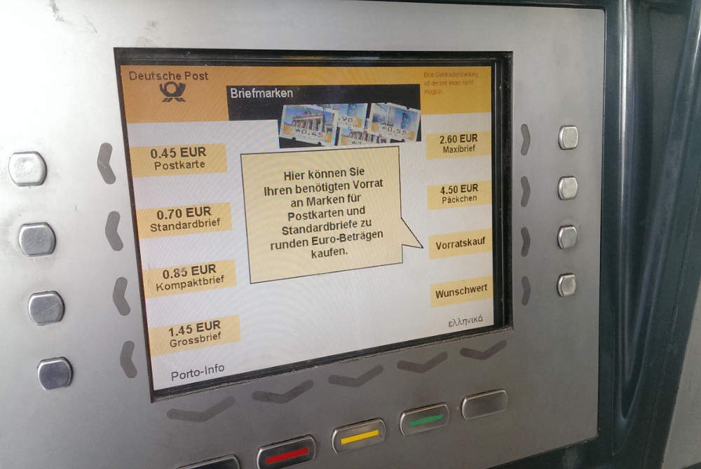
The first screen of the interface looks easy enough. Digital UI elements inform the user what they can select by pushing haptic buttons.
Your options are:
– six pre-defined postage buttons for postcards, various letter sizes and parcels sent within Germany
– one „stock purchase“ button
– one „custom value postage“ button
Sounds and looks pretty easy, doesn’t it? It actually is, if you aren’t sending anything outside of German borders.
When I stepped up to help the couple I noticed that they had changed the language of the interface to French, hoping that this would provide them with the required information and stamp. This fact and happenings later that day inspired me to write this blog post. The applied logic „if I change the language to the country language of my mailing’s destination the stamps that I can purchase will be the correct stamps“, seemed so absurd to me that I even tweeted about it:
Long story short: I was unable to help the couple and their behaviour bugged me so much that I returned a few days later to take pictures for this blog post. I wanted to further explore the couple’s behaviour but then went down a different rabbit hole instead. Tapping around on the machine, documenting screens I found a few flaws that, as it turns out could have prevented the language change logic and (spoiler alert!) could have easily helped the couple purchase the stamps they needed.
My initial idea had been to use the first screen to simply ask „Which country will you be sending the letter to?“ As each screen only allows 10 selectable options (due to the haptic buttons) this solution was out of the question. I had to sind a different answer.
On the first screen you will find various postage options. You must select the right postage depending on your mailing. The options I wasn’t familiar with are marked in red. These are mailings that I do not send out on a regular basis: I understand the words but not their meaning. „Kompaktbrief“ for instance translates to „compact letter“. What does that mean? Is the envelope less loose? Does is vary in shape? Is it square? No idea whatsoever!

Flaw #1: Speaking in company lingo.
You cannot assume that your customers know your lingo. If you want them to learn certain terms you must explain them in a way that can be quickly grasped. One idea would be to add this information on the first screen using a smaller type that describes dimensions and maximum weight. Another option would be a separate screen displaying this information in a easy to scan list.
As I was actively looking for a definition of „Kompaktbrief“ I noticed the „Porto-Info“ (postage info) button on the bottom left of the screen and thought this was going to give me answers. Instead the button takes you down a different journey. On screen #1 you are asked about your mailing’s dimensions. Your options are three predefined sizes and „other size“. I selected „other size“ and was then asked a total of 6 questions. At this point I have probably forgotten about my initial question („What does Kompaktbrief mean?“) and am fully emerged in the new task the machine has given to me (repeat that sentence slowly in your mind).
The complete „Porto-Info“ journey:
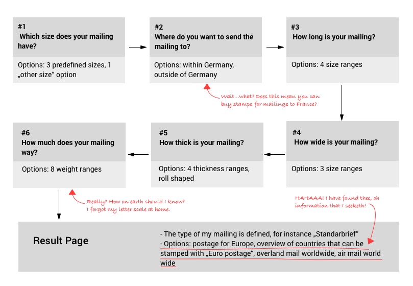
In the end the machine gave me a correct postage for a defined mailing and even gave me options to buy stamps for different destinations (nationally, within Europe, worldwide by land and air mail). My starting point however had been something completely different and a simple question: „What do Kompaktbrief, Grossbrief, Maxibrief & Päckchen mean?“ Instead of a simple answer I was thrown into an overloaded journey that was bumpy at best. But before we get into that, let’s talk about the elephant in the room: international postage.
Flaw #2: Using ambiguous wording.
While the postage info button does provide the expected information, the fact that this is the button that needs to be selected if your mailing will be leaving the country goes completely unmentioned. If the „postage info“ were to be replaced by „international postage“ the nice couple from the beginning of this story could have completed their desired task. But what would happen to „Porto-Info“? We only have 10 buttons per screen and by replacing „Porto-Info“ with „International postage“ all 10 would be taken. This can be achieved by correcting the next two flaws.
Flaw #3: Setting your customers up to fail.
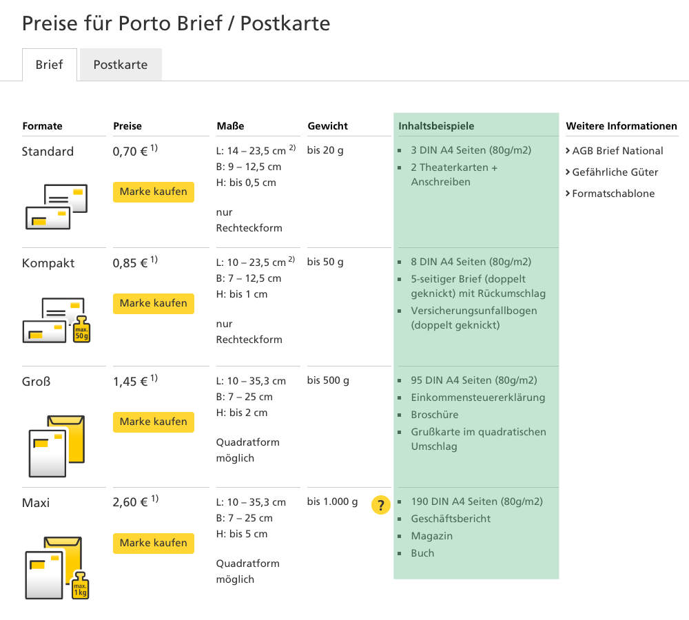
Deutsche Post, why so cruel? There is no way any user could provide an answer to question #6 (How much does your mailing way?) because there is no scale that can help determine the weight. However, I found information on the website of the Deutsche Post, which – if provided in this journey – could be of great help to the user because it answers the question in a more practical manner. In this list examples of mailing content are provided. For example a „Standardbrief“ weighs a maximum of 20grams, which could be 3 pages of paper or 2 theatre tickets and a cover letter. These are examples that humans can work with!
Flaw #4: Missing out on defining standards.
The examples of mailing content as seen on the website are really helpful when defining the weight of your mailing and also give a great overview of the different mailing categories of the Deutsche Post. It defiantly beats the 6 step journey provided on the postage stamp machine.
If you have found one solution that seems to work (and has maybe even been tested), turn it into a standard and get the rollout started for your other products. Providing different patterns of answers to the same question within your digital product portfolio leeds to confusion and forces your customers to learn and re-learn how to navigate through your products. People who have been to the website looking up what type of mailing category their letter was will recognize the same wording and the same list, even if it’s displayed on a machine with haptic buttons instead of a web browser or app. In the long run this course of action will make it easier to grow your portfolio as you already have a defined rule set you can base new developments on.
Flaw #5 Slacking on information architecture.
The only problem left would be that in the current design all 10 buttons are already taken by the other options. If „international postage“ would replace „Porto-Info“ there is no button left for the postage overview. However I am pretty sure that „Vorratskauf“ (stock purchase) is a wasted button because by selecting more than one stamp option or a stamp option repeatedly before paying you can combine different and as many stamps as you like in one purchase: voilá = stock purchase. This would make room for our „postage info“ button and would have meant a happy ending for the couple from the beginning of our story.
This is something that happens too often in projects: new menu items pop up in the life span of a digital product and are simply added to the list of menu items, which can get our of hand quite easily. Often taking a step back and viewing the options that are already provided can help preventing an every growing list of menu items, which will keep your product tidy, helping customers to navigate more easily. Your information architecture needs to be able to adapt to your changing products and requirements.
Flaw #6 Pissing off your customers.
Dear Deutsche Post, ist there a legit reason why your post stamp machines return change in the shape of 1 cent post stamps? If so please let me know.
Stay tuned for my next blog post on the analysis of the mysterious logic „if I change the language to the country language of my mailing’s destination the stamps that I can purchase will be the correct stamps“.